[tweetmeme]By: Martin Ove
If you want to make a quick chart using Google Charts, you definitely want to know about these sites from Google.
These are both official sites build to help you get started on the API.
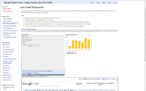
First off is the “Live Chart Playground” located here: http://code.google.com/intl/da/apis/chart/docs/chart_playground.html
This is where you want to go, if you want to create static charts, which are data represented as an image. The main feature on this site is the auto completion of various parameters, of which the chart is build.
If you want to define the range axis, you don’t have to remember that the parameter name is “chxr”. You just type “range” or “axis” and immediately an auto complete box comes up with suggestions. You can pick “Axis range” from here, and this parameter will be inserted into your box: “chxr=<axis_index>,<start_val>,<end_val>,<step>|…”
This really helped me get going with Google Charts, but not as much as when I stumbled upon another site, also from Google.
Pointy and clicky charts
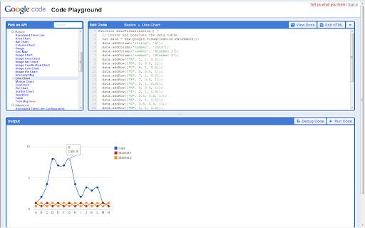
If you want to make charts that can be clicked, scrolled, zoomed and so forth, Google Code Playground is where you want to start – even if you don’t know any code.
The charts made with the interactive API is written in javascript and that makes interactivity possible. I’m no programmer myself, but with the Code Playground you don’t really have to be.
All you really have to do is to substitute the example-data with your own. And it’s do-able.
Check out this piece of code. It’s taken right from the dataset from the line chart example:

data.addColumn(‘string’, ‘x’);
data.addColumn(‘number’, ‘Cats’);
data.addColumn(‘number’, ‘Blanket 1’);
data.addColumn(‘number’, ‘Blanket 2’);
data.addRow([“A”, 1, 1, 0.5]);
data.addRow([“B”, 2, 0.5, 1]);
data.addRow([“C”, 4, 1, 0.5]);
data.addRow([“D”, 8, 0.5, 1]);
It looks a bit confusing at first, but notice the parts that say “addColumn” and “addRow”. They do exactly what they say. This is how the data looks in a table:
| Cats | Blanket 1 | Blanket 2 | |
| A | 1 | 1 | 0.5 |
| B | 2 | 0.5 | 1 |
| C | 4 | 1 | 0.5 |
| D | 8 | 0.5 | 1 |
For more information on how to make your spreadsheet data transform into code in an easier way, check out the previous post: From CSV to javascript – How to make data fit
Once you’ve copied your data into the code, you press “run code” and cross your fingers. If the chart looks great, you can export it as an url, which you can insert on your site in an iframe for example. You can also place the script on your site if your up to it.
I hope this will help you get started, I was glad to find these sites, that’s for sure.
Thanks for reading. Feel free to leave a comment if you have any questions.
Leave a Reply