Orkanen Katrina
29.08.2005
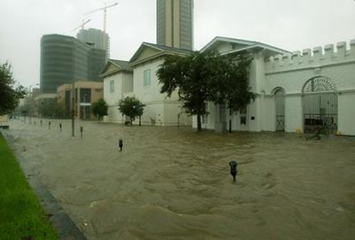
Orkanen Katrina ramte USA og gjorde især skade på byen New Orleans.
Også de omkringliggende områder blev ramt, som f.eks. byen Mobile i staten Alabama.

Water covers Royal Street in downtown Mobile, Ala., as Hurricane Katrina hit the Gulf Coast on Sunday, August 29, 2005. (photo and caption: au_Tiger01 @ flickr.com)
Jordskælv i Sichuan
12.05.2008
The text bubble is often not the best way to show of information in Google Maps. This is a custom layout which uses the user events of Google Maps the show the relevant information. Very buggy and only a crude sketch for now.
By: Martin Ove Christensen
Google Maps is very widely used, and with good reason. It’s very easy to create maps, and you can customize the information shown in the text bubbles by embedding images and so on.
One thing I hate, though, is getting pushed around a map, which is to small to display all the information, that the publisher wants to show. Here’s one example, and it’s even a mild one from the danish tv-station, TV2: Verdens dyreste naturkatastrofer(Worlds most expensive natural disasters)
In each text bubble, there’s a link to a gallery of pictures, one from each of the disasters. Linking and galleries are good, but it’s a shame that I have to leave the map to look at the pictures.
Cue: JavaScript, CSS and HTML
I believe that the cure is this: Learn! Learn how to make good use of the small space you have, by making the web dynamic. It’s built into the web, and my example doesn’t use anything but supported standards for browsers. The technologies are free too, so there’s no excuse.
Designing dynamic web elements have another thing going for it too. If it’s well designed, it will entice the curiosity of the user, eager to explore what lies beneath other elements on the map. Of course, there’s a potential pitfall in this too. The interactive and dynamic element may become incomprehensible and the user may “give up” on exploring it as a result of losing the general view. This is a design consideration.
Dynamic web elements are also very interesting, when it comes to mobile devices. The small screen make for a great challenge on how to present information in an intuitive manner without making the content too shallow.
That’s it. I hope you enjoyed checking out this crude example. Questions and comments are welcome, of course.
Thanks for reading!
